Genetic Constructor
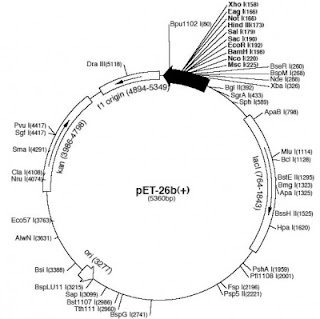
Linear vs Circular - data visualization for plasmids
11:22:00 PMTo me this seems inaccurate and inefficient to me in many ways by now.
- First, if I could actually look at my plasmid it would likely be coiled up like a telephone cord, and nowhere near this perfect circle.
- Second, drawing a circle takes up a bunch of real estate on paper or the screen - worst of all 90% is usually "backbone" so parts you take for granted and care about only to select the right anti-biotic resistance marker.
- So that leads to point number three - we have zoom in every time we want to get to the important part of the map - the insert. Why is that so? Wouldn't I want to see the most important part of construct in the overview?
We abstract away in all other aspects of visualization - zoom in of an organelle vs the entire cell, data trends vs tables, etc. Why not do the same for plasmids?
So what do you think - is the circular image easier to look at and understand, or the linear one?
 |
| Linear, condensed view of pET26b with inserts |
 |
| Linear, extended view of pET26b with inserts |
 |
| Traditional plasmid view of pET26b |
By Cornelia Scheitz


0 comments